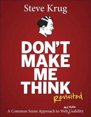
Don't Make Me Think, Revisited
by Steve Krug
The shortest book that fixed the most of my UI mistakes.
- Status
- Read · August 2017
- Bought
- August 23, 2017
- For
- Engineers who own the frontend but never studied UX · Solo builders shipping their own product UI · Anyone running their first usability test
Where it earned its place
The one-paragraph verdict
Krug’s core claim — every question a user has to stop and answer is a tax on your interface — has aged better than almost any design book I own. It’s short, genuinely funny, and ruthless about cutting its own length, which is rare and welcome. The criticism is fair, though: several screenshots are visibly from the early-2000s web, and an experienced designer will find most of it obvious. I’m not a designer, so “obvious in hindsight” was exactly the point — it named patterns I was already violating. The chapter on running a five-dollar usability test alone earned the cover price.
Who should read it
Read it if you’re an engineer who inherited the frontend and has never been taught why your forms annoy people. Solo builders and first-time founders shipping their own UI get the most leverage per page. Career UX designers can skip it — they learned this years ago and will be bored.
Where it earned its place
When I built the glassmorphism design system for Archives, Krug’s “don’t make me think” test was the filter I kept applying: every frosted panel had to survive the question “can someone tell what’s clickable in half a second?” More than one pretty component lost that fight and got flattened. The book is why the system has visible affordances instead of just looking nice in a screenshot.
Skip it if…
Skip it if you already do usability work professionally, or if you want depth on interaction design, accessibility internals, or research methodology. This is a first-principles primer, not a reference — its strength is brevity, which is also its ceiling.